2022
Role
UX/UI Designer
Services
Visual Design
Product Design
Prototyping
User Testing
Collaborators
David Barras
Kat Stillman
Prelude Connect
Prelude Connect is a specialized mobile app with a primary focus on empowering users in effectively managing their fertility treatment journey. It provides a suite of essential features, such as a personalized treatment schedule, communication with the care team, and an integrated calendar for tracking medications and appointments.
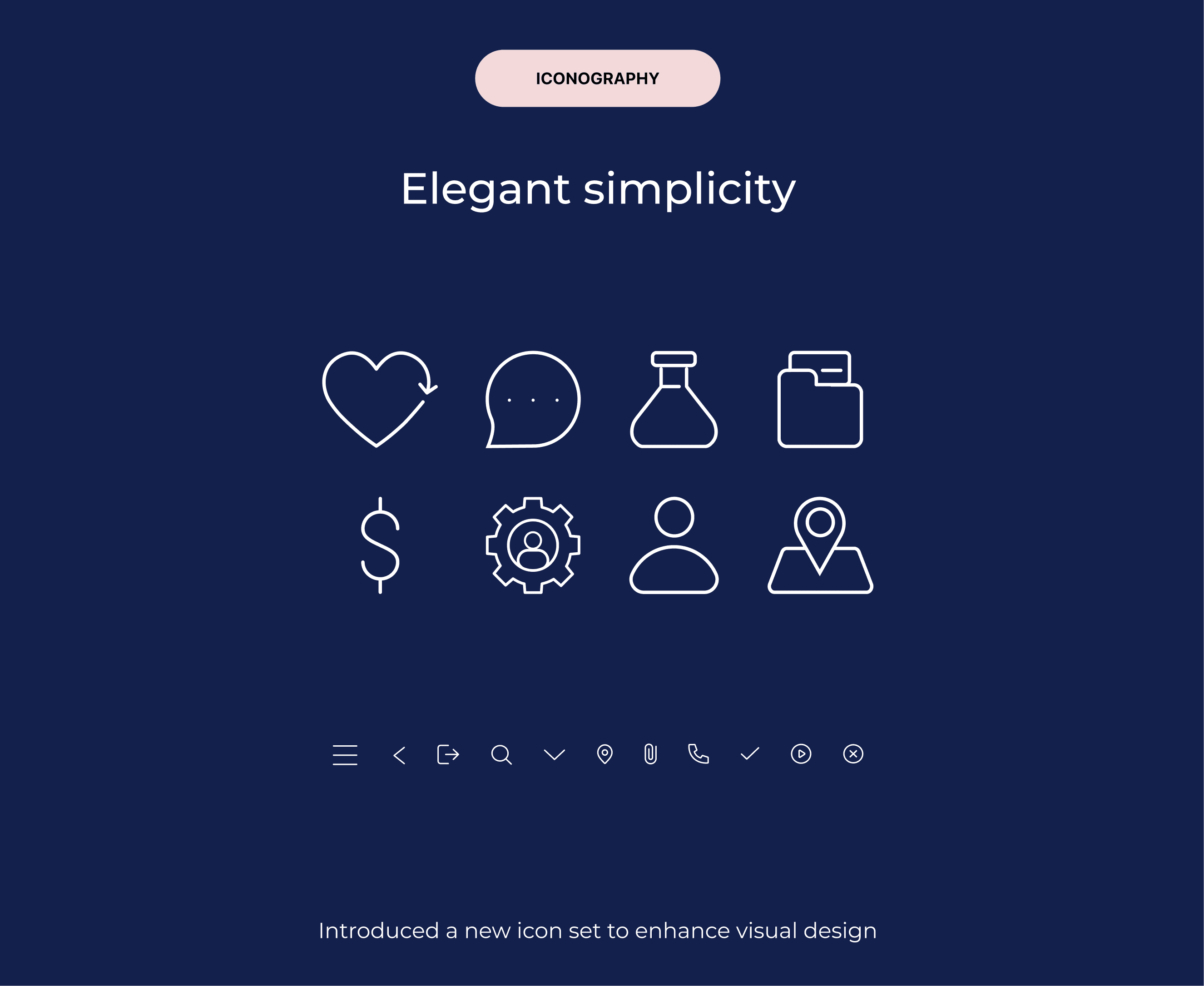
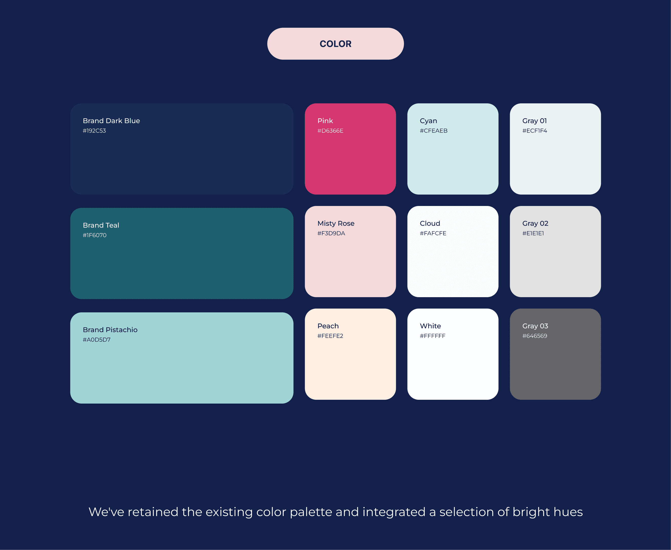
As a UX Designer, I spearheaded a comprehensive re-design aimed at enhancing user experience and revitalizing the app's overall aesthetic. My responsibilities included data analysis, concept ideation, aligning key stakeholders on product goals, designing user flows, visual design, prototyping, user testing, and incorporating user feedback into design iterations.
Problem
Prelude users have shared feedback on usability challenges and a desire for a better visual experience in the app.
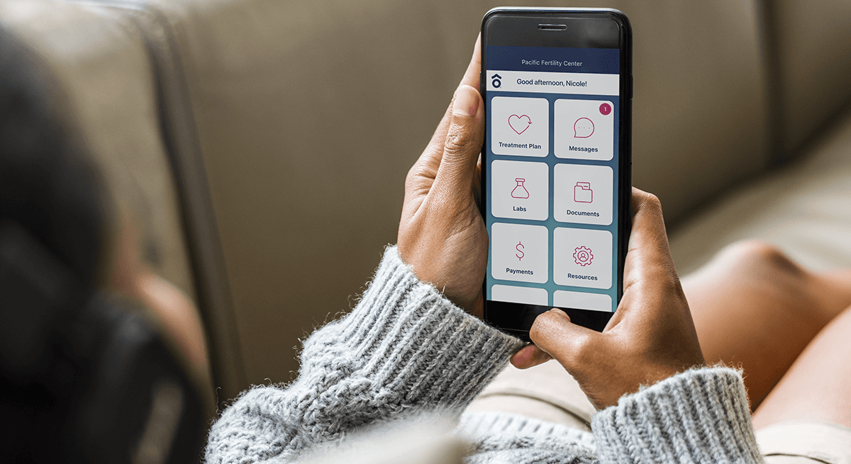
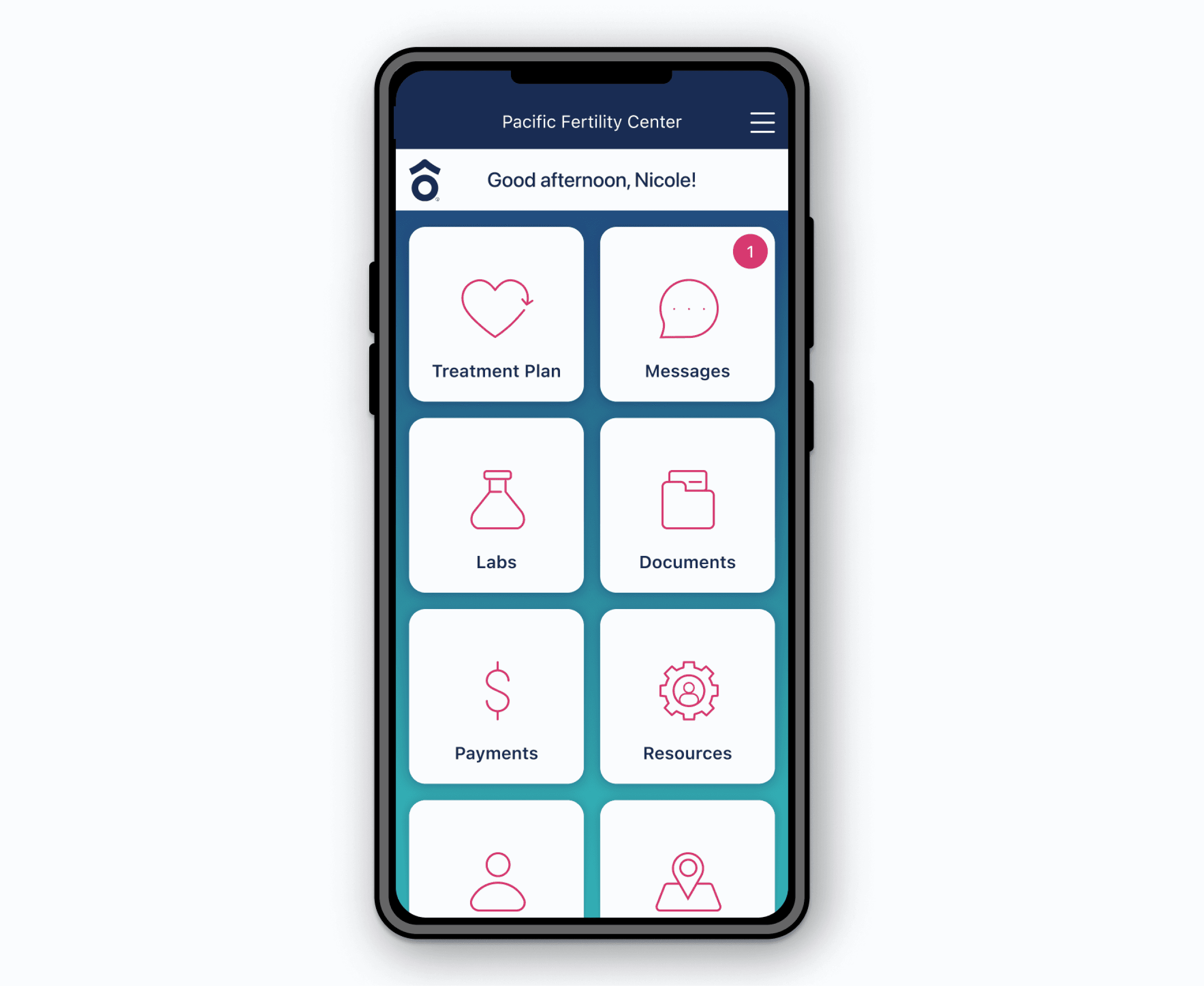
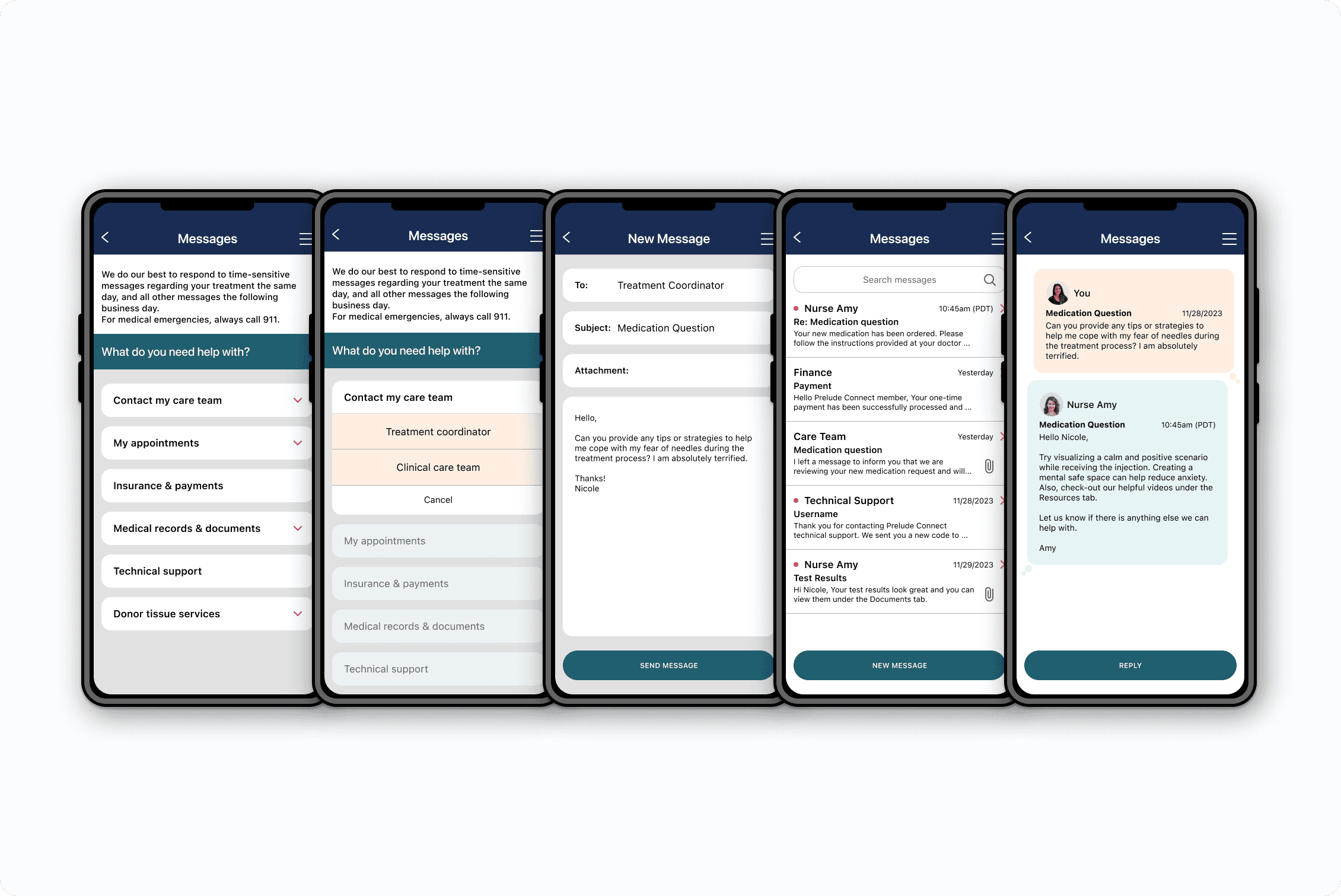
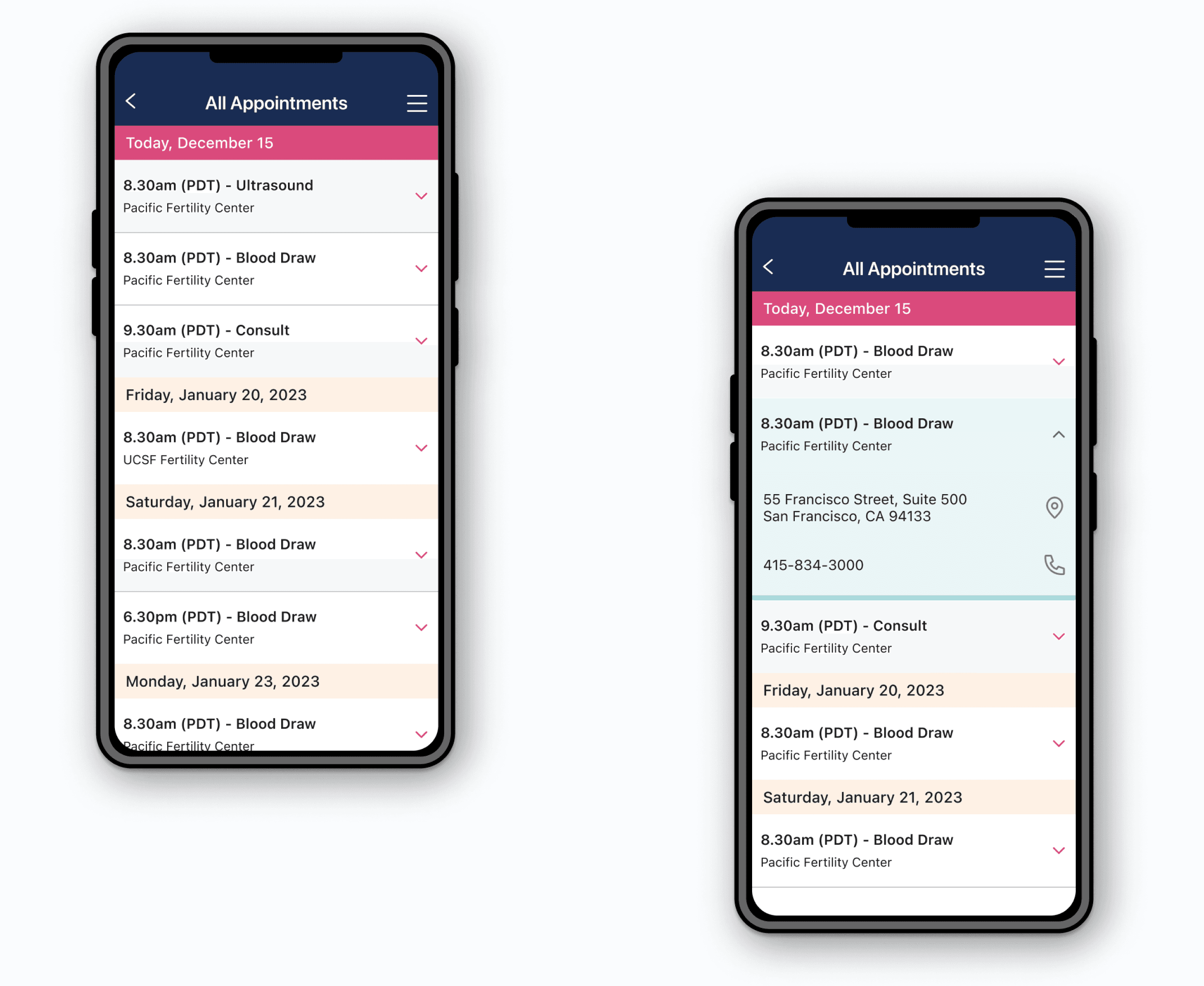
Navigating through the application feels like a maze, making it hard to find important information and the Home Screen options are considered confusing. Connecting with the care team is seen as a challenge, especially when scrolling through extensive contact details.
Design Process
The design process began with comprehensive research into Prelude Connect user journey.
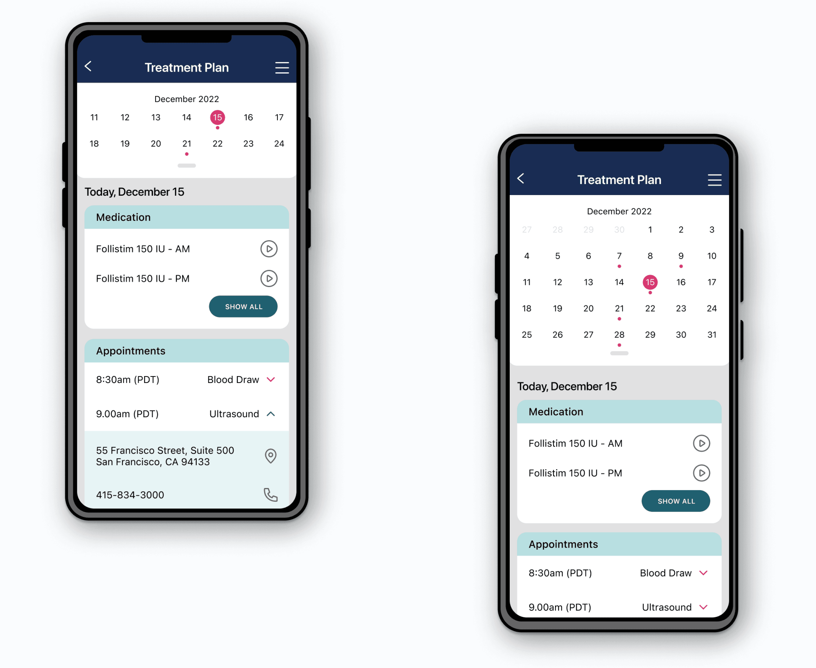
To address the navigation maze challenge, we modified the information architecture, seeking opportunities to improve accessibility and foster intuitive navigation. Subsequent to a successful card sort exercise, the Home Screen underwent a meticulous redesign. It now showcases all available options in a clear and user-friendly layout.
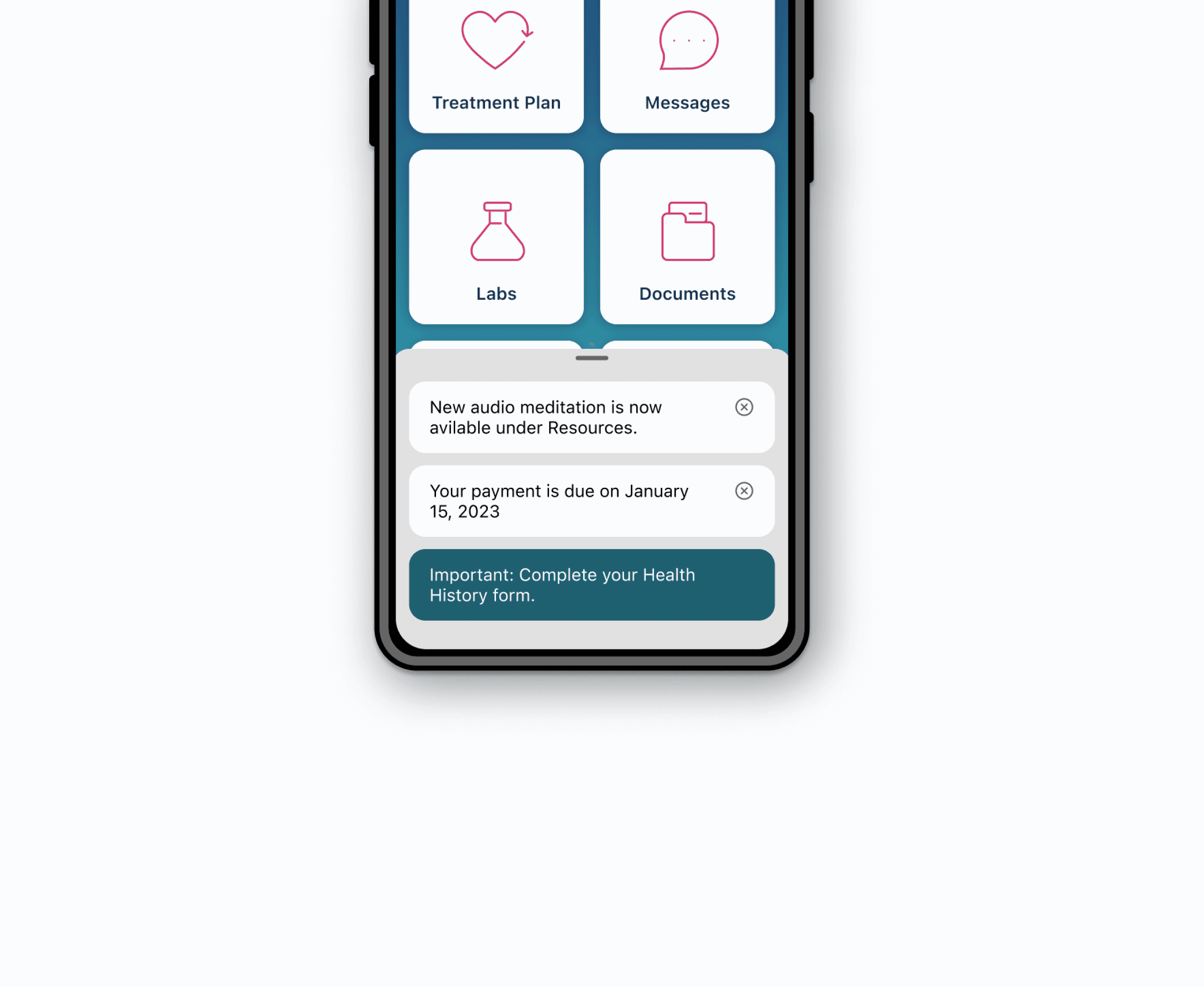
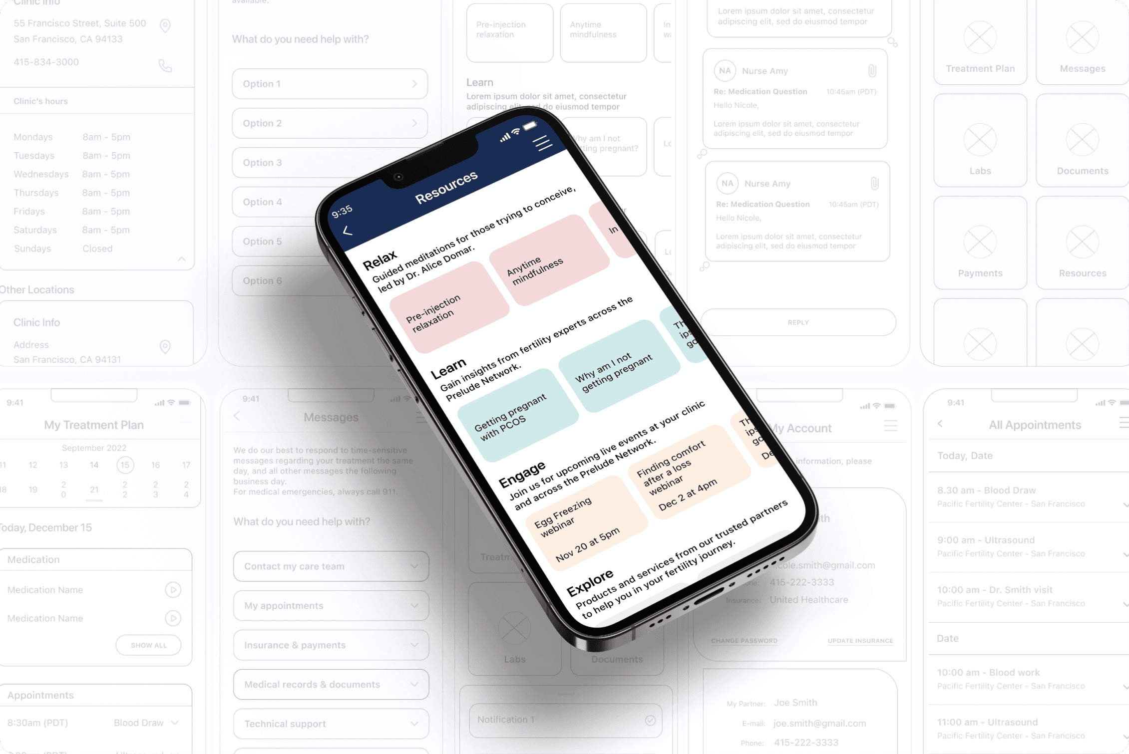
In elevating patient communication with the clinic, we've implemented a New Message indicator on the Home Screen, promptly notifying users of unread messages for seamless connectivity. Additionally, a new Notification functionality has been incorporated to enhance the user experience by providing a readily accessible platform for alerts.
Results
Improved Navigation: The information architecture redesign contributed to a more straightforward and intuitive navigation experience.
User-Friendly Home Screen: The Home Screen redesign successfully addressed the confusion, presenting all options in a clear layout, positively impacting the overall user experience.
Efficient Communication: The introduction of the New Message indicator streamlined communication, ensuring users stay connected with the care team seamlessly.
